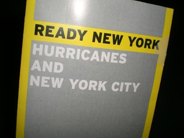
It was an eerily timely brochure about hurricanes and severe weather hitting New York City.

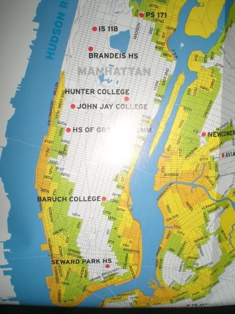
Thanks for the info. There's also a handy map inside.

Now, I didn't actually read the pamphlet or map key, but I'm assuming the orange and yellow sections show the areas of total death and destruction, while the green shows areas that will be completely under water.
Perhaps after today they should have re-titled the piece "Ready New York: Slightly Heavy Downpours." That would have definitely helped out today.
